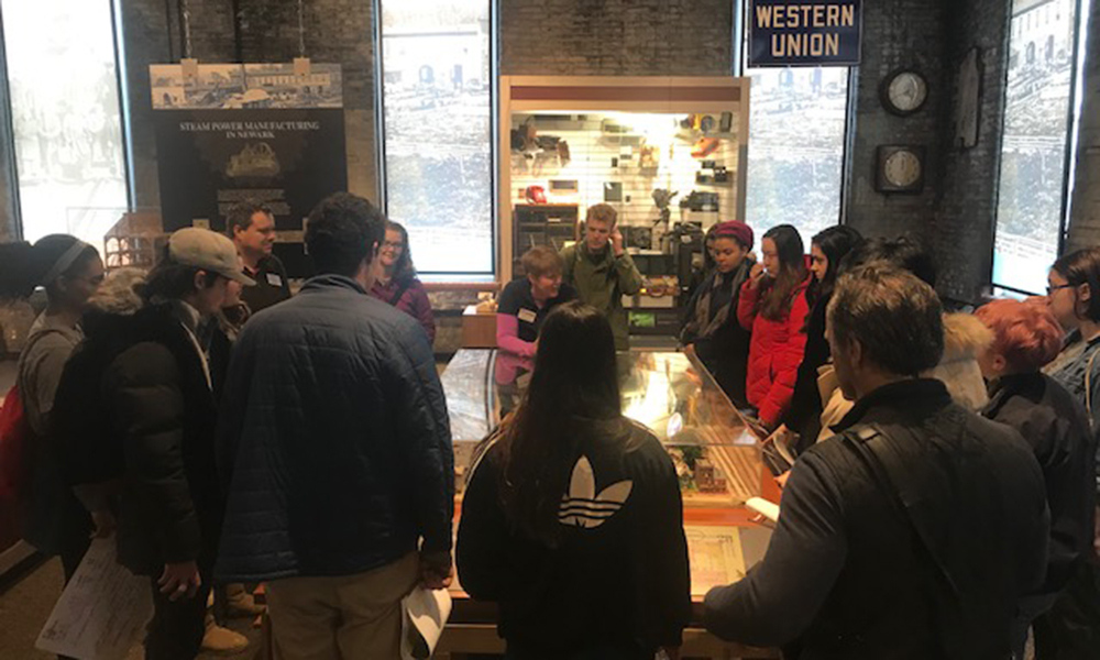
In the days leading up to the first day of spring classes, I had the pleasure of participating in the Red Frame Lab’s UX (user experience) Design Workshop. In this intensive three-day workshop, about 25 to 30 of us visited The Works: Ohio Center for History, Art & Technology in Newark, Ohio to assess some customer experiences and, collaboratively, find ways to improve and enhance them.
Going into this opportunity, I had no idea what UX design really was. I had heard a lot about “design thinking” over the past year-and-a-half, and puzzled over how to convey such a seemingly nebulous concept to the prospective students I’ve shown around campus as a tour guide. Furthermore, many employers in the digital marketing space, a field I want to pursue post-graduation, are currently seeking UX designers, or even candidates who have had even the slightest exposure to UX design process.
In short, one of the most comprehensive definitions of UX, or user experience, is “the design of anything independent of medium across [device] with human experience as an explicit outcome and human engagement as an explicit goal.” In a sense, UX design has always existed, if not by name, in the intentional engineering of everyday objects, as simple as door handles meant to push or pull, or as complex as finding your way through massive theme parks or city streets.
But UX design is more front-facing and user-centric. Instead of examining who the company or the brand is to the consumer, UX design focuses on who the consumer is to the brand. With an emphasis on human experience and engagement, it is a more personal, in-depth understanding of human behaviors according to their environment.
As participants at The Works, our research was fully immersive and highly personal. For the two days we were there, we obtained a better understanding of the museum’s mission, observed patrons, and even got to experience the museum ourselves. We played with educational toys and simulators in the science museum (geared toward younger children); walked through the floor dedicated entirely to the history of Newark industry and transportation; observed the marvels of outer space and of our own planet in the brand-new SciDome; and even watched a glass-blowing demonstration.
Afterwards, we separated ourselves into teams, each focusing on a different aspect of the museum for which we could implement an opportunity. Some focused on “wayfinding,” or the process of making it easier for parents and children to navigate the museum. Others of us focused on multisensory learning experiences, in which we discovered ways to learn the history of Newark beyond text and images. For a kinesthetic learner, this might look like an interactive demonstration of the canal transportation system that ran through Newark at one point, which is what our team focused on. Others even took on the challenge of trying to appeal to an entirely new demographic of 20- to 30-year-olds through the incorporation of mindfulness practices.
The process was daunting. As someone who has never claimed to be artistic, and has always been a big-picture thinker, nailing down the details of a demonstration for a transit system of which we all had no real conception was incredibly challenging. Furthermore, understanding how, say, a 9-year-old boy who is a kinesthetic learner and has an abundance of energy might interact with the right kind of demonstration was an even greater challenge. But it was his persona — along with tight time constraints — that drove our team forward. Our hard work and perseverance culminated in a prototype we presented to the board of directors who were amazed with the level of talent that comes from Denison students.
Overall, this was a rewarding experience I’ll never forget.
This article was originally published in The Denisonian.


